Design color trends overview. We were recently invited to attend a “5 a 7” cocktail party by the tile company Ceragres. The cocktail also included a lecture on colors by Feras Irikat, Director of Designer and Marketing for a California based design firm. He gave a very interesting and dynamic presentation on the science behind colors and the evolution of design color trends. He talked about his personal experiences and presented scientific research in order to demonstrate how important color is in our everyday lives.
People see colors differently
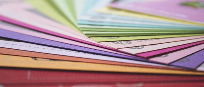
Color is the direct result of light, without it we would quite literally be left in the dark. Since people perceive colors differently, the science of color is very ambiguous. People will also respond differently to color depending on their previous experiences. In addition to these differences in perception, colors will change according to their environment and constantly changing light. This is why a certain color may seem fitting with its environment at one point in the morning, may clash with the same environment in the evening.
Personal preferences vs. scientific approach
Individual preferences for certain colors often collide with scientific preferences. For example the blue is seen as more of a soothing color. It is best used in areas where we want to promote a calming environment such as in corporate settings like conference rooms, law enforcement spaces or waiting areas. The red on the other hand is more of an active color. It is ideally used in spaces that encourage achievement or promote awareness such as athletic facilities, passageways and corridors and fast food environments.
We must be careful since this is when personal preferences come into play. To some people blue may seem like calming color, while to others it will be overly calming and may induce depression. The same can be said about the vibrant color red. To some people red can reflect a positive attitude, while invoke anxiety and raise blood pressure in others.
Design color trends from 1950s to now
An interesting part of the lecture was when Feras elaborated on the evolution of colors and trends. According to Feras, every decade had its set of trends. The 60s took the classic look from the 50s and jazzed it up with shapes and colors. The 70s gave way to the hippie era, giving an organic twist to the 60s. Every decade took inspiration from the last, but still ended up with a completely different trend.
However, something interesting happened in the early 2000s. Technology and personal computers enabled more and more people to find unique design trends and inspirations on the internet. This inspired individualism as well as a decade with no unique design trends. Nevertheless, people still tended to follow particular style guidelines. Although people are freer to express themselves in design, many seem reluctant to do so.
Feras stressed the importance of bringing out individual style rather than simply complying with the trends. People have different attachments to various colors. Whether these differences are cultural or emotional, they are engrained in each individual and should not only be respected, but also encouraged.
Emerging movements in color design
Feras ended his presentation with three new interesting design color trends.
- Modern sensitive trend aims to bring out individual style while remaining subdued. This is for people who dare to be themselves, but prefer to remain calm in their designs. It uses more pastel hues of different shades.
- Premium twist trend brings out the most of people’s personalities, and is characterized by optimum self-expression. It is the mix of patterns and colors as someone desires and has not rules.
- Smart Fiction trend combines technology with color. Mixing different metallic, from gold to silver passing through copper, with vibrant or more subdued colors.
As designers, it was highly interesting to hear a professional provide insight on something we firmly believe in: trends are fun, but personality is the more important. When we are working on a custom kitchen renovation project, we always aim to create a space that fits our clients’ unique personalities and style preferences.
Understanding the science behind what we do for a living was a refreshing breath of fresh air.
If you are curious to learn more about our approach to kitchen design, we invite you to visit our styles and colors section.
We hope you enjoyed our article on design color trends. If you have any questions about design elements or kitchen renovations we invite you to contact us today.